Rear Bay Unlocks a Brooklyn Heights Kitchen
Updating a space for modern living and tailoring a design for a new homeowner's needs does not always require a massive addition for more space, or a complete reorganization of the main living spaces.
This was the case when our clients brought us a Greek Revival Rowhouse in Brooklyn Heights, wanting to update the parlor floor.
.jpg)
-before.jpg)


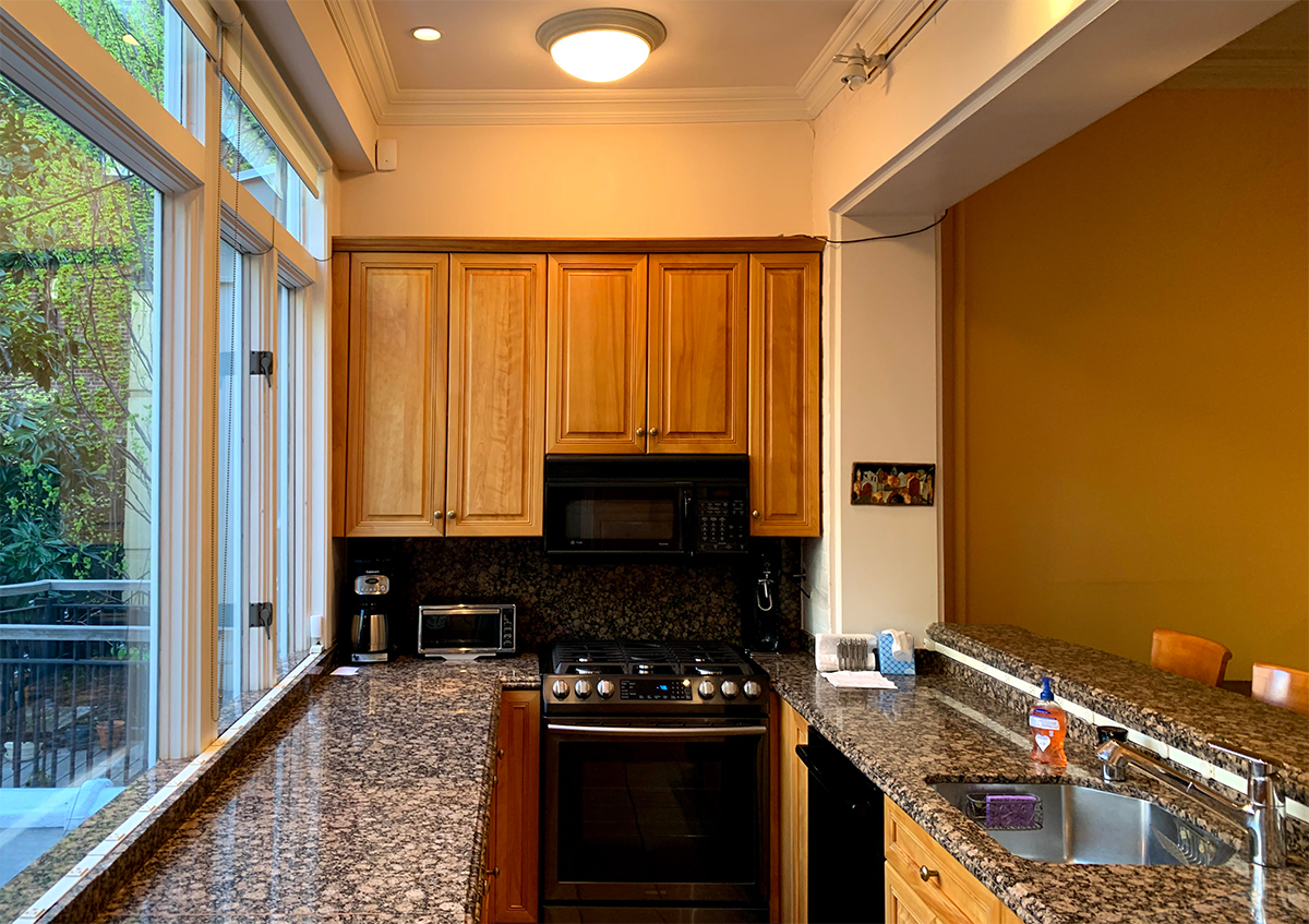
In New York City rowhouses, the main staircase is typically located at the center of the house. Here, however, the staircase is located at the rear of the historic volume of the house. At some point in the building's history, a two-story addition was placed at the rear of the house, and the kitchen was relocated into this new space. The stairs cut into the overall width of the property, where most clients look to have a large, combined kitchen and dining room and strong connection to the exterior.
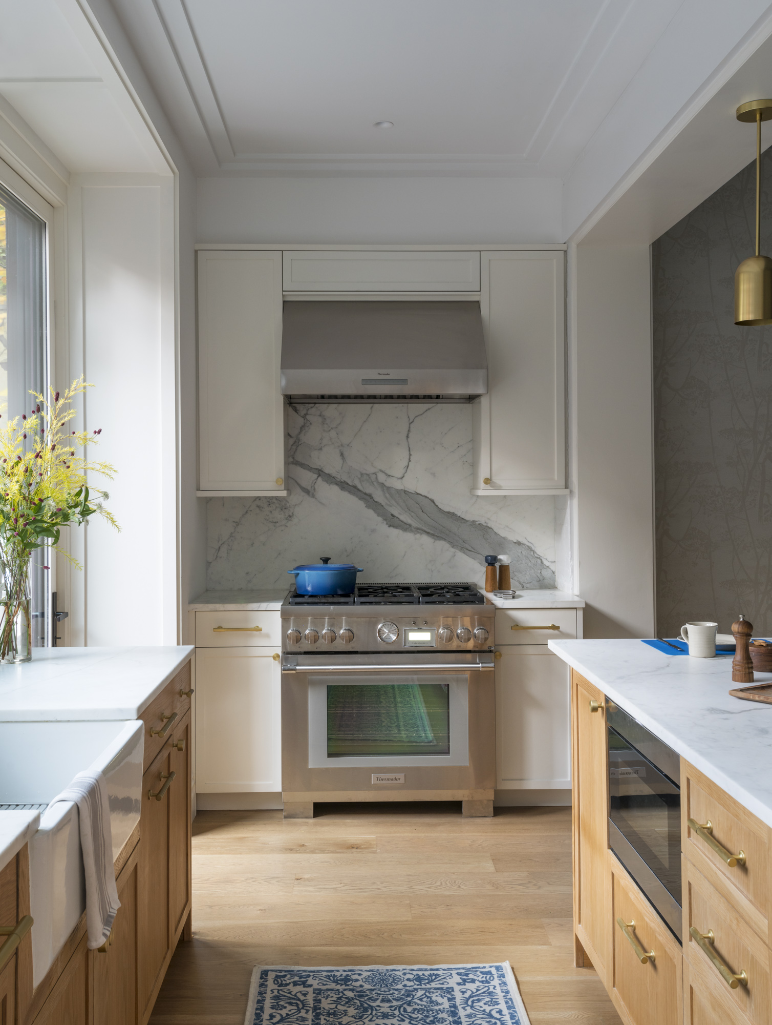
The limited available space informed our decision to keep the kitchen inside the shallow, full-width extension beyond the historic brick wall of the rowhouse. Rather than completely expanding the rear of the house, we looked to a solution that architects and designers have been using for centuries – the bay window. This gave us the few inches needed on the interior with the least intrusion into the exterior yard.
.jpg)
.jpg)
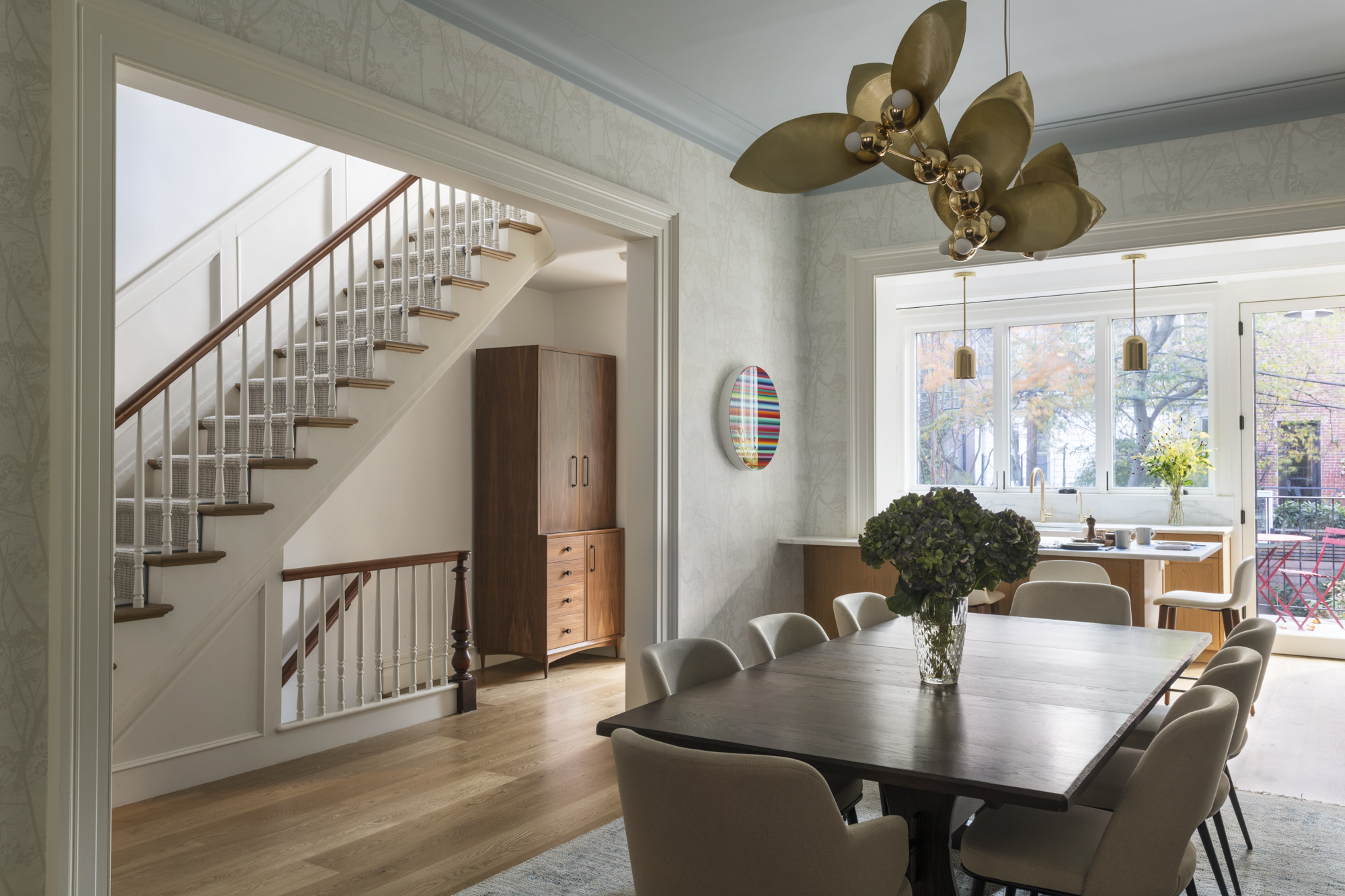
Adding only about 24 inches of interior space off the parlor floor not only unlocked the functionality of the kitchen, it also created a gracious indoor-outdoor experience, providing a connection to the deck and rear yard. We thought of the kitchen as a series of three zones which spread across the rear of the house. The central zone serves as the area for cooking prep, communal gathering, and informal dining at the peninsula. This zone provides a transition between the kitchen and the formal dining room. We flanked it with a cooking area on one side and storage on the other. The updated kitchen creates a physical connection to the dining room and the rear yard, while bringing natural light into the core of the floor.

Each of the spaces on the main parlor floor – the living room, dining room, and kitchen – feel cohesive and bright. We considered this floor as a sequence of spaces and thresholds, each with their own identity, but heavily connected with large openings from one to the next. Large openings allow for spaces to work well on their own, while being fully open and connected to each other and the floor as a whole. The separation of the rooms allowed for storage and a well-placed dry bar between the living room and dining room.


The partial-width roof deck connects to the rear yard, which was previously only accessible from the garden floor. As part of the renovation, we also created an outdoor space on the second floor above the kitchen.
This was a fun, and collaborative project that included a creative client, alongside a great contractor, MLZ General Construction, and interior designer, Marie Fuer. The level of care, creativity, and craft is apparent in the final results.


.jpg)